Article Components
Our example of polished formatting using our markdown components
I’m a section header
These are created with a single # and should be used for the main chunks of content.
I’m a subsection header
These are created with a ## and should be used for the main chunks of content.
What content do we support?
We support basic markdown components like
- unordered lists
- inline
code - bold text
- italic text
- Ordered list is also acheivable
- Only use an ordered list when every item is followed by another list item
- If an image is contained within an ordered list, it will cause issues, see guides below.
| Attribute | Description | Platform Supported |
|---|---|---|
| Name | The “friendly name” of the device, set by the user. | Windows, macOS, iOS |
| Hostname | The DNS hostname that the device assigns to itself. Often based on the device name. | Windows, macOS, Linux |
| Make | The manufacturer of the device. | macOS, Linux, iOS |
We also support custom components like callouts, which offer 2 levels of severity
Success Callout
Here’s a look at a success callout
Info Callout
Here’s a look at a success callout
Extreme Callout
Use this sparingly for crucial information. For example, a crucial step in authoring these callouts is to include a blank line above and below the callout body in the markdown. Make sure there is no indentation at the beginning of a line too.
Info Callout
Here’s a look at a info callout
We also support code blocks with click to copy behavior.
user@linux:~$ /usr/bin/twingate-notifier console{ "requiresCompatibilities": ["FARGATE"], "containerDefinitions": [ { "name": "twingate-connector", "image": "twingate/connector:1", "memory": 2048, "cpu": 1024, "environment": [ { "name": "TWINGATE_NETWORK", "value": "<YOUR TWINGATE SUBDOMAIN>" }, { "name": "TWINGATE_ACCESS_TOKEN", "value": "eyJ0eXAiOiJEQVQiLCJh..." }, { "name": "TWINGATE_REFRESH_TOKEN", "value": "suoodqhy0niwjzpY_ki8..." } ] } ], "volumes": [], "networkMode": "awsvpc", "placementConstraints": [], "family": "twingate-connector-<NAME>", "memory": "2048", "cpu": "1024"}Image with a caption
The image component should accept a caption prop and render a caption like the grey text below if one is submitted.
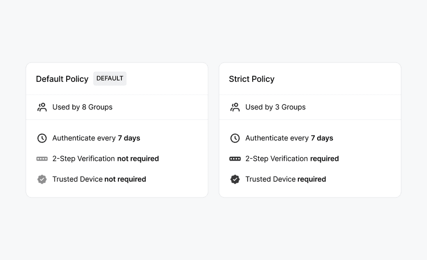
Integration links
Are you writing a new integration article? If you think that there’s a new logo to add here, ping Charles or Zach on Slack.
Tabbed Sections
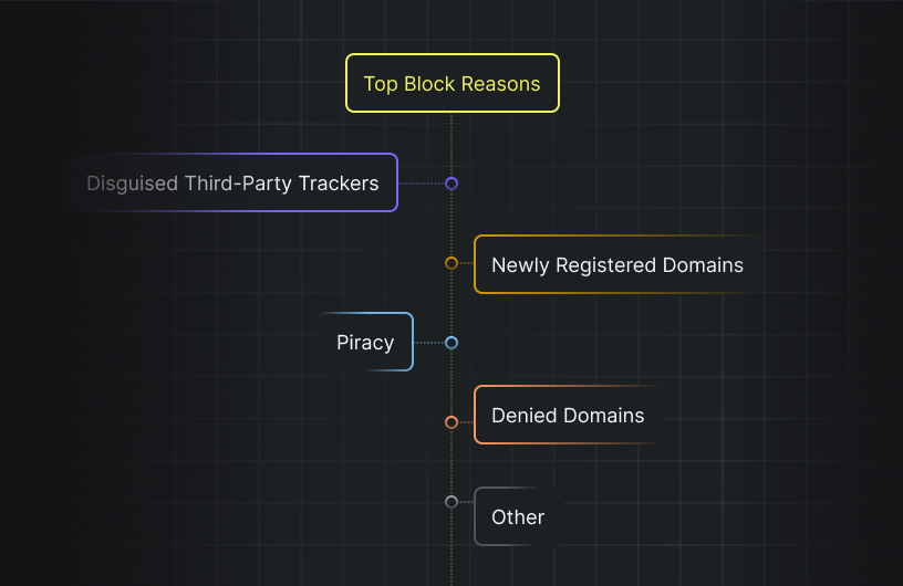
We support tabbed sections for organizing related content. Here’s an example:



Subsection headers should be used for step-by-step guides
To provide styling enhancements, linkability, and prevent images from stretching, we use these headers in step by step guides…
How do I make a step-by-step guide?
1. Authoring content
Author content using these markdown components. Limit changes to within the /content folder
2. Check that you have followed our formatting guide
For our formatting, please see How to Contribute to Docs
Typography examples
This is standard body copy. Lorem ipsum dolor sit amet, consectetur adipiscing elit. Maecenas semper arcu ac odio blandit, et volutpat ex vulputate. Aenean luctus massa justo, in feugiat felis dapibus sit amet. Donec placerat urna eget enim cursus fermentum. Nullam venenatis feugiat metus a tincidunt. Praesent a volutpat enim. Nullam at nisi non elit fermentum dictum quis nec massa.
This is some italic text.
This is some bold text.
This is an H1
This is an H2
This is an H3
This is an H4
Smaller headings, like H5 and H6, are unsupported. Note that these headings will render at the same size as body text.
This is an H5 (unsupported)
This is an H6 (unsupported)
Last updated 2 months ago